
Assembled by Donald Jackson
With a Working Catalogue
Colorado Springs, CO
1981
When I was a graduate student at the University of Iowa, 1946 – 1948, and later while I served as editor of a university press, I was deeply interested in typography and the history of printing. I had become a hand typesetter and pressman, issued some small pieces from my own private press, and begun a modest collection of books about books.
In 1948 I learned that Dr. Otto F. Ege, dean of the Cincinnati School of Art, had spent forty years collecting damaged or incomplete copies of early books. He sold the leaves separately to persons who did not wish to own complete copies.
I could ill afford complete copies and did not need them; a single page or leaf would suffice to study the typography and format of the work. So I began to purchase leaves from Ege, a few at a time ad appropriate to the resources to a young man studying on the G. I. Bill. I obtained others in various ways, picking them up at a time from the few dealers who had such items for sale. I recall my delight when Philip C. Duschnes, the New York dealer in rare books, sent me his Catalog No. 68, about 1949, offering a large collection of original leaves from manuscripts, incunabula, and American colonial presses.
This is a working collection, ranging from 1150 to 1804 A. D. Not all the great printers are Represented here – Gutenberg is not – but all the great advances in typography are exemplified. The collection includes leaves from some of the world's great books, and from printers and type designers who have led the western world in the craft of bookmaking. By 1804, the date of the final leaf in the collection, the famed typefaces of Garamond, Caslon, Baskerville, Bodoni, and Bulmer were in use. Since that time there have been innovations but few advances; typography remains the same as it was at the turn of the nineteenth century.
Donald Jackson
Colorado Springs
September 1981
DONALD JACKSON COLLECTION OF ORIGINAL LEAVES - CATALOGUE PREPARED BY DONALD JACKSON
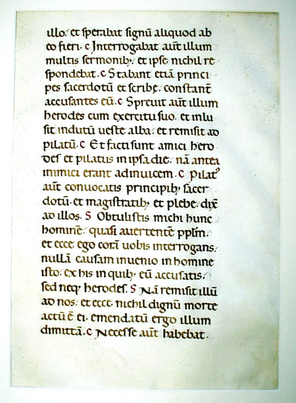
# 1
| 1150 A.D., Italy. Manuscript on vellum. Lectionary. Revised Carolingian script. |
THE LECTIONARY is a collection of selected readings from the scriptures, especially from the Epistles and Gospels and also from the homilies and the acts of the saints and martyrs. These lessons were read after a period of silence, by the sub-deacon, in a side pulpit. This necessitated the isolation of these readings of these to a separate volume.1150 A.D.ITALY. Lectionary. Vellum leaf (13 x 9 inches). Written in an unusually fine and large Carolingian book hand. Maunde Thompson calls this period and type the finest of all European book hands. The exactness and beauty of this open and round Lombardic book hand was only rivalled, not surpassed, by the humanistic scribes of the second half of the 15th century. With ornamental initial.
# 2
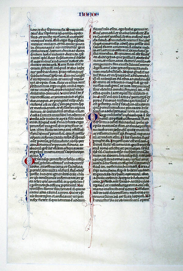
| 1230 A.D. , France. Vulgate Bible. A well-written page, with numerous initials and filigree decoration. On vellum. |
# 3
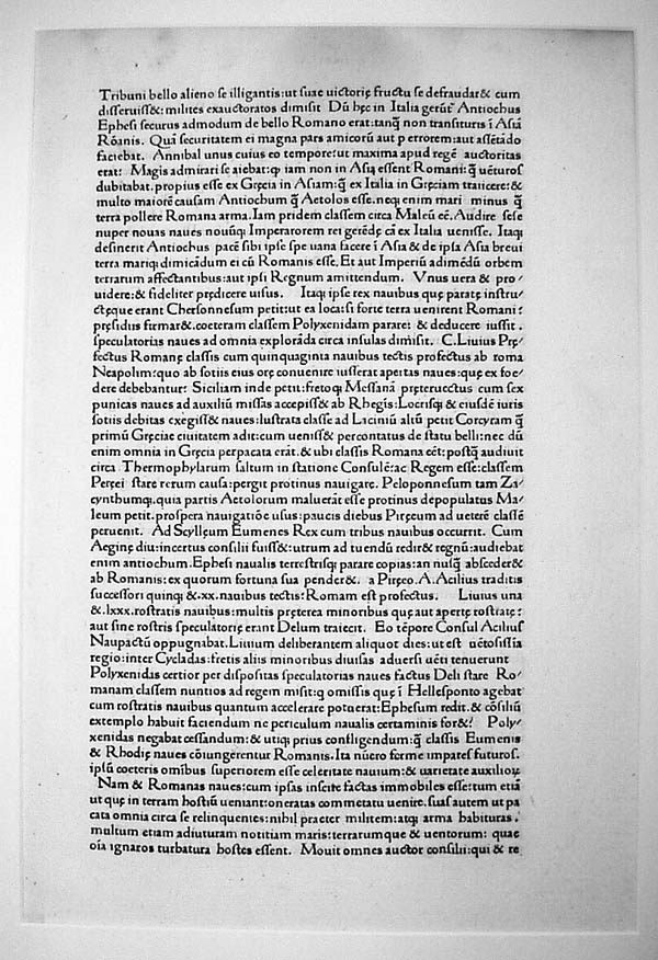 | 1470 A.D., Venice. Livy’s Roman Decades. Wendelin Da Spira, of the first printing house in Venice. |
Titus Livius, born 56 B.C., was one of the best known of Roman historians. His great work "Decades," covered the history of Rome from its foundation to the year 9 B.C. Only 35 out of the original 142 books have been preserved but these give us in fine oratorical language Livius’s burning desire to inculcate again in his decadent era the virtues and patriotism of the earlier great Romans. His "pictured page" with vividness of detail, graphic portrayals of events, "reporting" of fine speech of his heroes, was the inspiration for the painters and writers of historical themes in the Renaissance period. Historians for eighteen hundred years repeated blindly these mythical orations as true facts. Livy is still read, not as a textbook, but as a masterpiece of narrative eloquence. Factual errors do not always invalidate brilliant exposition.
# 4
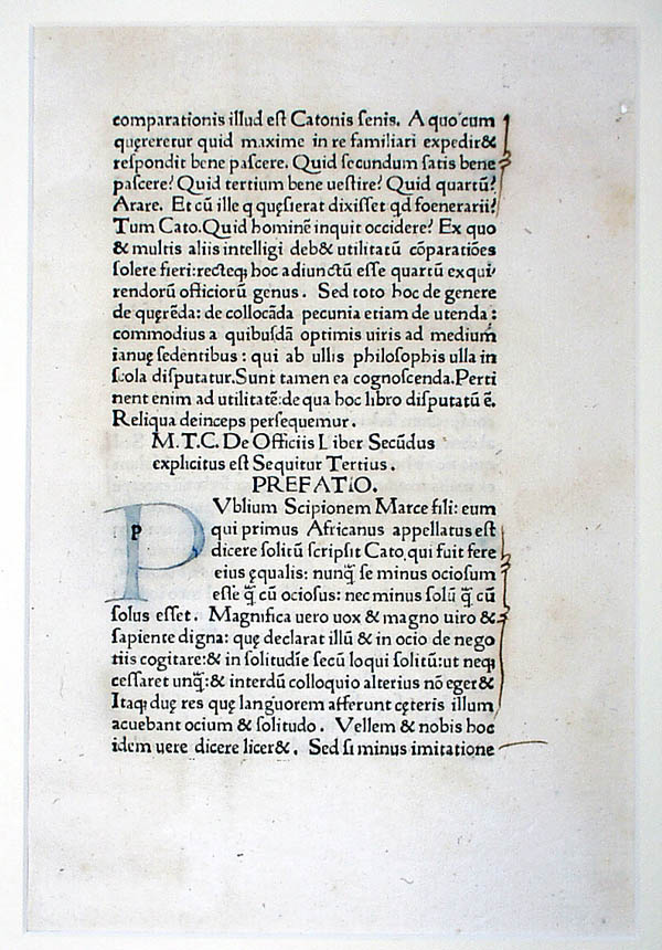 | 1472 A.D. , Venice. Cicero, De Officiis. Wendelin Da Spira |
This work, On Duty, (De Officiis) was addressed to Cicero’s son Marcus in the year 43 B.C. In it Cicero gives his viewpoints on many philosophical and ethical questions which center mainly around the theme borrowed from the Stoics, "Man must be virtuous in order to be happy." Like many wealthy Romans, Cicero had sent his son to study philosophy in Athens under the philosopher Cratippus. From Cicero’s famous letters, we learn that he exchanged books with Cleopatra, who was in Rome when this text was written. We wonder whether she received a copy of the De Officiis and, if she did, whether she read it. Cicero’s diction and style established Latin as a vehicle for great prose. This work has the distinction of being the first classical book that appeared in print.# 5In the year 1469, John of Spire and his brother Wendelin, Germans from Rhenish, Bavaria, were well-established and encouraged by the city senate of Venice to establish themselves as the first printers in that city and were given an exclusive five-year privilege. When John died the following year the plague, the senate decided that the grant or "patient" given to the brothers had lapsed. Wendelin, however, continued to print four or five years longer, until competition forced him into bankruptcy. Venice soon became the printing center of Europe; before 1480, more than fifty printing establishments were in operation. Daniel Berkeley Updike states that the two brothers, John and Wendelin, made and used the first truly roman type. It is also thought by some scholars of printing history that Nicholas Jenson worked for the de Spires in the year 1469. It is possible that he really was the creator of the first type used by this press.
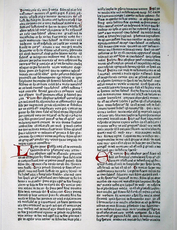 | 1472 A.D. , Strassburg. Lyra, Postilla super Psalterium. John Mentelin, printer. |
1472 A.D. GERMANY (Strassburg). John Mentelin, Postilla super Psalterium, by Lyra Folio, double columns, rubricated initials. Mentelin’s press was supposedly the second in Europe, and the first in Stassburg. He apparently learned his craft with Gutenberg and was so successful that he amassed a fortune, while his master went bankrupt.
#6
 |
1472 A.D. , Venice. Dream of Scipio. Printed by Nicholas Jenson. |
Note both Greek and roman types. Jenson’s roman typeface is considered to be the prototype of all roman faces, and one of the most beautiful.
PRINTED IN JENSON’S ROMAN AND GREEK TYPES
1472 A.D. ITALY (Venice). Ambrosina Theodosius Macrobius. Saturnalia and Somnium Sciponis. Printed by Nicolas Jenson. (II ¾ x 8 ½ inches).
# 7
 | 1472 A.D. , Rome. Nicholas de Lyra, Postilla Super Psalterium. Printed by Sweynheym and Pannartz in an evolving roman face. |
Conrad Sweynheym and Arnold Pannartz left Mainz to establish their printing house in Italy, and are credited with establishing the craft of printing in that country.
# 8
| [Originally identified as: 1473 A.D. , Augsburg. Dialogues of Pope Gregory. Printed by Johann Beamler, this first German edition was issued at the monastery press of S.S. Ulrich and Afra. In 2008, CC visiting professor John Romano disputed this description. He believes this may be something by Martin Luther.] |
Baemler’s types have a local character and are considered the first purely German types.
# 9
 | 1476 A.D. , Augsburg. Ramerus de Pisis, Pantheologia. The most important work printed by Gunther Zainer, first printer in Augsburg. Note the semi-gothic typeface. |
# 10
 | 1483 A.D. , Augsburg. Richenthal, Concilium zu Constanz. Printed by Anton Sorg. |
THE FIRST PRINTED ILLUSTRATED BOOK ON HERALDRY
1483 A.D. GERMANY (Augsburg). Richenthal. Concilium Zu Constanz. Anton Sorg. (9 ½ x 7 ½ inches). With hand-colored heraldic wood-cuts. Pointed gothic type.
Ulrich Van Richenthal, the author, was apparently merchant of Constance and an interested eye witness of the exciting and dramatic events which occurred during Meeting of Council 1414-1418 A.D. This great council of church was called for three purposes: (I) causa unionis, (2) causa fidei, and (3) causa reformationis. With the abdication of Pope John XXIII, Gregory XII, and the deposition of Benedict XIII, the great schism was ended. John Huss and his friend Jerome were summoned before the Council, charged with introducing heretical doctrines and therewith burned at the stake, but little was done with the causa reformations. There were popes, emperors, cardinals, bishops, thousands of knights and laymen, a total of 70,000 visitors during a four-year period to the little town of Constance, with a population of only 10,000. These created daily pageants and exciting events for the newsgatherer, Richenthal. He did not publish his notes until fifteen years later.# 11Anton Sorg, who began printing in Ausburg in 1475, was noted for his illustrated editions. One of the most ambitious and noted was this work of Richenthal, with its 1158 coats of arms of the various dignitaries who attended the council. "These armorial cuts," William Morris wrote, "which are full of interest as giving a vast number of curious and strange bearings, are no less so, as showing what admirable decoration can be got out of heraldry when it is simple and well done."
 | 1485 A.D., Venice. Sacrubusco’s Sphaera Mundi. Printed by Erhald Ratdolt. |
"THE OLDEST WORK ON ASTRONOMY THAT EUROPE PRODUCED"
1485 A.D. ITALY (Venice). Sacrobusco. Sphaera Mundi. Erhald Ratdolt. (7 ½ x 5 ¼ inches).
Joannes de Sacrobusco, (John of Holybush, Hollywood or Halifax), English mathematician and astronomer, was born in Yorkshire, studied at Oxford and then taught at Paris until his death in 1256 A.D.Sphaera Mundi, his most important work, is largely a paraphrase of Ptolemy’s Almagest. This superficial abridgement enjoyed for several centuries a great reputation, as it represented a return to the more enlightened cosmogony of the Greeks – in which the earth was a stationary globe around which were revolving in circles and epicycles, the sun, the planets, and stars, while the contemporary writers held that the earth was a circular plane surrounded by water, the heavens resting on pillars like a tent, and the stars carried by appointed angles. This little work of Sacrobusco is divided into four books:
The printer, Erhard Ratdolt, a German, conducted his press in Venice from 1476-1486. More than any other printer of the 15th century, he helped to wean the "Cradle books" from the manuscript tradition. Many "firsts" in typography are due to Ratdolt’s skill and imagination. In Sphaera Mundi, he was the first to employ a number of colors on a few of the pages. The diagrams were apparently produced not by wood-cuts but, for the first time, by means of metal strips embedded in lead. The first complete title-page, (1476), the first type specimen sheet are also assigned to this noted German printer. Ratdolt’s types are direct descendants of the famous Jenson type and were much admired by William Morris.
- the sphere of fixed stars
- the circle of the zodiac
- the length of days in different zones
- the eclipse during the crucifixion was not natural but miraculous
# 12
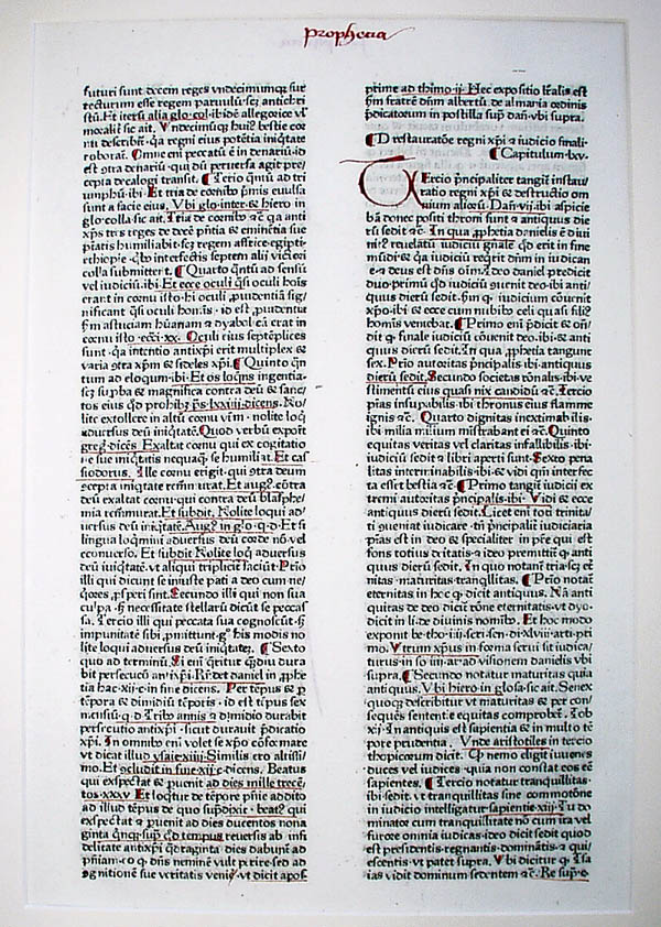
| [Originally identified as: 1485 A.D., Venice. Dante’s Divine Comedy. Printed by Petrus de Piasio [In 2008, visiting professor John Romano identified this leaf as 1489 Argentine [Strassburg]. Jacobus de Voraigne's Golden Legend. Lives of Saint Vincent and Saint Basil. Georg Husner, printer. For a digital version of the entire book, see: http://diglib.hab.de/inkunabeln/s-262-2f-helmst/start.htm?image=00089.] |
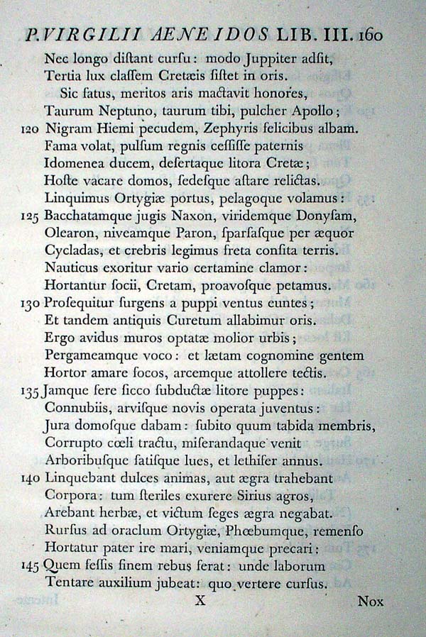
Dante Alighieri, the supreme exponent of the Middle Ages, is, according to Ruskin, "the central man of all the world as representing in perfect balance the imaginative, moral and intellectual faculties, all at their highest." Dante’s great work, the Divine Comedy, is an original creation. It is explained in his own words: "The subject of the whole work, taken literally, is the state of souls after death, regarded as fact. Taken allegorically, its subject is man, insofar as by merit or demerit, in the exercise of free will, he is exposed to the reward or punishment of justice." In the narrative of his journey, which was inspired by a version in 1300, Dante is accompanied by two guides, "Vigil, who stands for human reason,…and Beatrice, who symbolizes divine grace." Virgil cannot lead the poet beyond Purgatory, while Beatrice lifts him through the spheres of Paradise by contemplation. The last line symbolizes the new "love which moves the sun and other stars." The magnitude of Dante’s conception is no more wonderful than the composition and form in which he expressed it with metrical virtuosity through the hundred cantons. The lasting popularity of the work is evident from the thousands of editions printed and the vast critical literature that has been written concerning this work.This edition of the Commedia, printed in Venice, 1491, by Petrus de Piasio of Cremona, is one of the best known if all numerous fifteen century editions. For several years, (1480-1483), de Piasio was in partnership with A. Torresanus, into whose hand the equipment of Jenson had fallen after the latter’s death.
# 13
 | 1493 A.D., Nuremberg. Anton Koberger, the Nuremberg Chronicle. Two leaves, one with hand-colored woodcuts. |
1493 A.D. GERMANY (Nuremberg). Schedel. Liber Chronicarum. Koberger. With colored wood-cuts. (7 ½ x 12 inches).
Dr. Hartmann Schedel, the author of the most interesting 15th century book, (from the point of view of the layman), spent more time in reading history than in the practice of medicine. World histories, compiled by Italian, English, and French chroniclers, treated German history rather slightly; to correct this condition, Schedel persuaded two wealthy merchants of Nuremberg, Sebald Schreger and Sebastian Kamermaister to underwrite the compiling a new chronicle. Schedel divided his work into the usual six ages of the history of mankind and added the seventh, in which he foretold the coming of the Anti-Christ, the destruction of the world, and judgment day. Two noted artists, Michel Wolgemut, the master of Albrect Durer, and William Pleydenwurff were engaged to make the wood-cut illustrations. In all, 1809 pictures, printed from 645 blocks, are in the book. Ninety-six blocks were used to portray 596 emperors, popes and other important historical features. Cato becomes Dante by the mere change of a title. In a similar manner 26 cuts illustrate 69 cities. The wood-cuts of personages with long fingers and rather unkempt hair have usually been assigned to Wolgemut.The printer, Anton Koberger, trained as a jeweler, established his first press about the year 1470 and continued as printer and publisher for over 50 years, employing at various times over 100 workmen on 24 presses, or as binders, illuminators or artists. He had agents not only in various parts of Germany but also in distant cities as Warsaw, Budapest, Paris, Venice, and Rome. Yet with all these outlets, 16 years after the publication, about five hundred copies of the Nuremberg Chronicle were unsold. A plain copy cost two florin, whereas a copy with painted wood-cuts, six florin, a considerable sum of money.
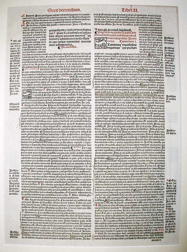
# 14
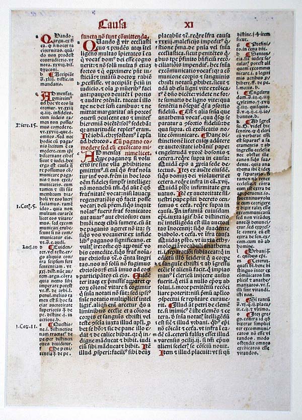
| 1493 A.D., Basle. Gratian, Decretum, part 2, cause 11. Johann Froben, printer. |
# 15
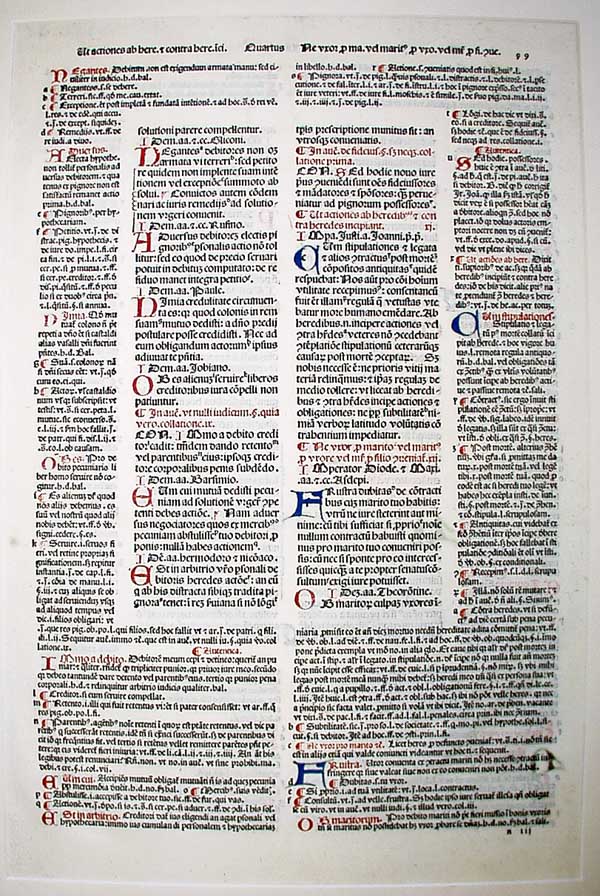 | 1496 A.D., Venice. Batista de Tortis, Justinian Code. |
1496 A.D. ITALY (Venice). Justinian. Corpus Juris Civilis. Baptista de Tortis. Folio leaf. (17 x 11 inches).
Justinian’s greatest accomplishment was the codification of Roman law. This was done under his direction, by his principal law officer Tribonian, assisted by ten learned civilians, between the years 529 and 533 A.D. This intensive enterprise produced Corpus Juris Civilis, a work in four parts.
- The Code, in which earlier codes were recast and brought together.
- The Digest, 9, 123 excepts of legal opinions gathered from over 2000 works.
- The Institute, a concise manual aid.
- The Novellae, or laws of Justinian.
The formulation of Roman Law is often considered the greatest triumph of the ancient world, and its reorganization and transmission in the Justinian codes one of the greatest gifts of the Middle Ages to the western world. Roman law established each man’s right in regard to his labor and property. It was a powerful tool in the struggles between the secular rulers and the powerful of the church.
This code of laws survived the centuries primarily because it was flexible, capable of growth, and international in viewpoint. Universities were crowded by students from far and near the text expounded by noted glossators. Meynial states that this Roman law, more than any other factor, facilitated the passage of west European societies from the economics of the agricultural family to the rule of commercial and industrial individuals. It stressed the principle of representative government; this, together with its ideas of justice and equality, are now part of our American government.
The printer, Baptista de Tortis, was one of the first printers to specialize in jurisprudence. His reputation for accuracy of texts enabled him to dispose of edition after edition of 2000 or more copies, folio size, of his various publications, while many another 15th century printer went into bankruptcy after printing only one or two volumes in editions of 500 copies or less.
Tortis’s round, gothic type found such favor with the early Spanish printers that they copied it for several centuries under the name "letra de Tortis." The typographical problem of planning a certain amount of text to correspond exactly with related glosses complete on the same page was successfully handled in this unit.
# 16
 | 1497 A.D., Paris. Phillippe Pigouchet, Book of Hours. |
1497 A.D. FRANCE (Paris). Book of Hours. Phillippe Pigouchet. (6 ¼ x 4 ¼ inches).
The most famous printer of Books of Hours, Pigouchet, issued his first volume on 1491. For the next five years, he used the same series of illustrations, but in 1496 the new and now famous illustrations were used for the first time. These included the noted Dance of Death series of small illustrations, showing that all classes of society were subject to the inevitable command to walk with death. Other illustrations concern themselves with secular subjects, representing with realism the occupations and sports of everyday life. Many authorities believe that these illustrations were relief cuts in copper instead of wood. This edition was dated March 30, 1497, and contains six new additions to the series of Death’s victims among women. Another and final six were added in the next edition dated August 7th of the same year. The criblee process, tone effects of white dots, on a black ground often appears in these illustrations. Updike speaking of Pigouchet and other printers of this period, states, "A particular feature of the French press of the 15th century was the exquisite manner in which type and decoration were harmonized and combined."
# 17
 | 1497 A.D., Nuremberg. Anton Koberger, the Nuremberg Bible. The only German Bible issued by the most prolific printers of the 15th century. |
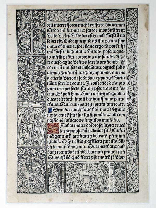
# 18
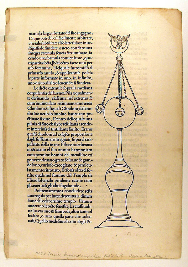 | 1499 A.D., Venice. Hypnerotomachia Poliphili, printed in the house of Aldus Manutius. Considered to be the most beautiful production of the Italian press of the period, richly illustrated and superbly printed. |
#19
 | 1512 A.D., London. Jacobus de Voragine, The Golden Legend. Printed by Wynkyn de Worde. |
1512 A.D. ENGLAND (London). Jacobus de Voragine. The Golden Legend. Wynkyn de Worde. (11 x 7 ½ inches).
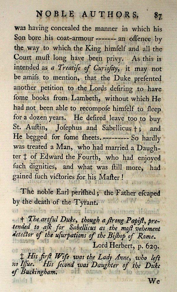
Jacobus de Voragine, born about 1228 in Varaggio (Varazze) joined the newly founded order of Dominicans in 1244 and in 1292 became archbishop of Genoa. While still a young man, he wrote the Golden Legend (Legenda Aurea), biological stories from martyrologies, encyclopedias, and early writers. Especial emphasis is placed on the struggle of the saints with the devil, who turns up in every possible form, bird, snake, beast or woman. The saint always triumphs. These stories were often translated into the vernacular to the profit and delight of the common folk; they also inspired numerous motifs for the church windows and sculptured panels of the medieval cathedral. Luther denounced this work as immoral. Wynkyn de Worde, a native of Alsace, was the apprentice and successor of Caxton. Although Worde printed in all more than 700 books between the years of 1492 and 1534, he apparently had little interest in literature. Updike speaks highly of the black letter types used after 1500, which show a decided French influence in their refinement over the various Caxton fonts.
# 20
 | 1513 A.D., Venice. Varroni’s Cornucopiae. Printed by Aldus Manutius. Manutius’ famous italic type, used in this edition, were patented by three successive popes, but was freely counterfeited during his lifetime. |
# 21
 | 1514 A.D., Lyons. Decretal of Boniface. Printed by Maillet, who started a printing house in Lyons in 1489. Note the many interesting type problems successfully solved. Text occupies small portion of the printed area, and the notes occupy the rest. Printed in red and black in three sizes of type. |
# 22
 | 1515 A.D., Venice. Lucretius. Printed by Aldus Manutius. Note the practice of printing each line of poetry with a roman, rather than italic, letter at the start of the line. Unusual swash letters. |
# 23
 | 1517 A.D., Nuremberg. Theuerdank. Printers unidentified, but represents the first use of Fraktur type. |
# 24
 | 1518 A.D., Venice. First printed Greek Bible, issued by Aldus Manutius. The type font is said to have contained more than 700 characters, as an attempt was made to include all the contractions and abbreviations used by the scribe. |
# 25
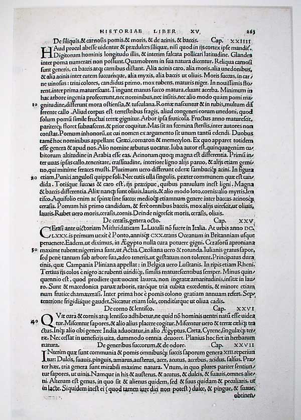 | 1525 A.D., Basle. Pliny’s Natural History. Printed by one of the pioneer houses of Switzerland, that of Johann Froben. |
# 26
 | 1527 A. D., London. Boccaccio’s The Fall of Princes, Princesses, and other Nobles. Translated by John Lydgate. Printed by Richard Pynson who, in addition to William Caxton and Wynkyn de Worde, was among the first to bring printing to the British Isles. He was Printer to the King from 1508 until 1529. |
Note that the black – letter face is still in use here, though long since abandoned in Italy and elsewhere on the Continent.
# 27
 | 1540 A. D., France. Suetonius’ Lives of the Twelve Caesars. Printed by Robert Estienne. |
The types of Claude Garamond, here used in the italic. Were to become dominant in France and to assume an important place in the typeface of the Western world.
# 28
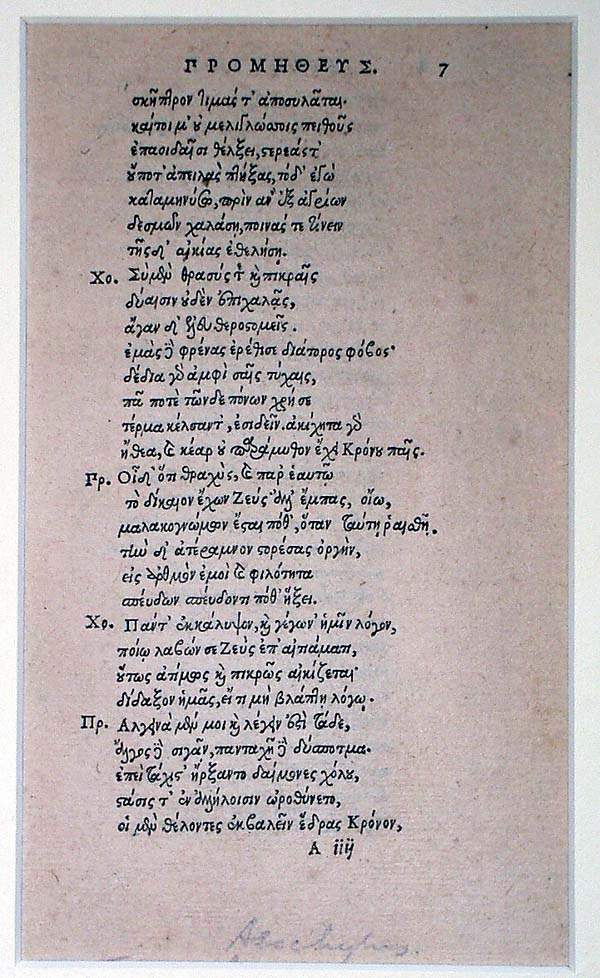 | 1552 A. D. , Italy. Turnebus’s edition of Aeschylus. |
# 29
 | 1555 A. D., Geneva. The latin Bible of the Estienne family. |
LEAF FROM A
Stephanus Latin Bible
1555 A.D.
Excudebat Roberto Stephano
Conradus Badius (Geneva)
Third octavo edition of the Latin Bible issued by the famous of the scholar printers, the Stephani or Estiennes. This issue, the work of the most eminent scholar of his day, Robert Stephanus, is generally considered to be the earliest Bible to divide the text into numbered verses. Because his writings and publications were frequently censored and prohibited by the Theological Faculty of Paris, Robert Stephanus, shortly after the death of his royal patron, Francis I, moved his press to Geneva, where was printed.
# 30
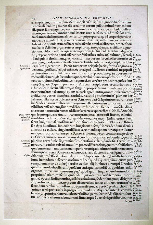 | 1555 A. D., Basle. The Opornius edition of Vesalius. Garamond types used. |
# 31
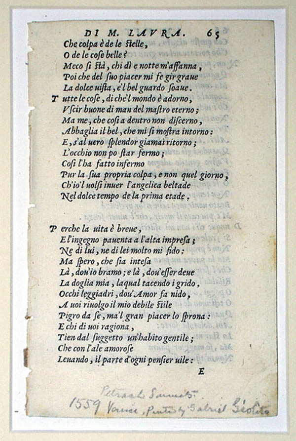 | 1559 A. D., Venice. Giolito edition of Petrarch’s sonnets. |
 | 1570 A. D., Geneva. Arrangement of the Great Latin Orators. Another edition from the printing house of Estienne or Stephanus. |
1570 A. D. SWITZERLAND (Geneva). Henri Estienne, Arrangements of Greek and Latin Orations by the noted scholar and printer, Henri Estienne. The types, Greek and Roman, were designed by the famous type designer, Claude Garamond. Six recuttings of Garamond types have been made since 1919 by various typefounders.
# 33
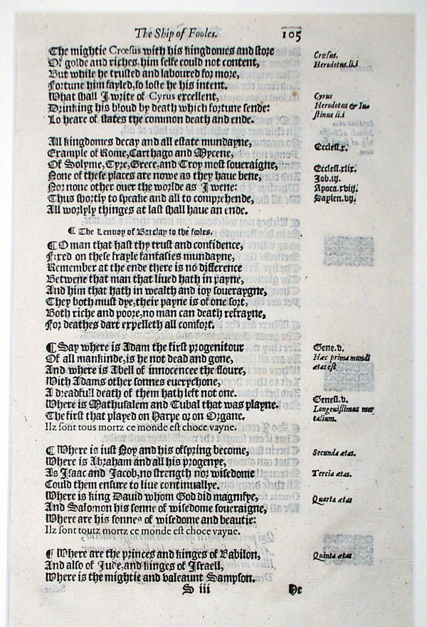 | 1570 A. D., London. Barclay’s "Ship of fooles of the world." Printer, John Cawood. Mixture of English black – letter and roman types. |
BARCLAY * SHIP OF FOOLS
"Gorgeous gallery of goofs" – James D. Hart
PRINTED BY JOHN CAWOOD, LONDON, 1570
Early in 1509, the translation of Sebastian Brant’s Narrenschiff by the English priest, Alexander Barclay, was first printed in England. This work of Barclay’s called "Ship of fooles of the world" is more a ship of fools of sixteenth century England than it is a translation of the earlier work. It presents an understanding of the poverty-stricken priests and court-ridden life of the common people during the reigns of Henry VII and Henry VIII. Both the original author, Brant, and the translator, Barclay, held to the general design "to ridicule the prevailing follies and vices of every rank and profession under the allegory of a ship freighted with fools. Fools are evil and malicious people to be displayed and scolded." Barclay installs himself as captain , "I am the firste fole of all the hole navy." These writers found a hundred and ten categories, even in those simple days, to ridicule. It is done in delightful verse. Zeydal states that this book "played an important role in outmoding medieval allegory and morality and in directing literature into the channels of the drama, the essay and the novel of character." The woodcuts which added much to the popularity of Barclay’s translation are crude copies of those which appeared in the original Basle edition, often attributed to young Durer.
John Cawood, who printed this second edition of the Ship of fooles in 1570, was appointed Royal Printer by Queen Mary in 1553. Strangely enough, he retained this lucrative post under Queen Elizabeth, who, however, made him share the honor and privileges of this title with another printer, Richard Jugge.
# 34
 | 1572 A. D. , London. The Bishop’s Bible, printed by Richard Jugge. Two conjugate leaves. |
The Bishop’s Bible. Printed at London, 1572, by Richard Jugge. Two Leaves herewith.
There were two Editions of this Black Letter Bible, that of 1568, and that of 1572. It was an attempt of English ecclesiastics to replace the Geneva (or "Breeches") version of Miles Coverdale, of whose popularity they were jealous. The ornate Woodcut Initials, some showing scenes from the Classics, were originally intended for an edition of Ovid, and they caused such a storm of criticism that they were never again used for the Bible.
It is sometimes called the "Leda Bible", from the Woodcut of Leda and the Swan, at the opening of Hebrews; also the "Treacle Bible" because in Jeremiah VIII. 22, this word is used for "balm".
See: A Edward Newton: The Greatest Book in the World. Pp. 24-25.
# 35
 |
1572 A. D., Frankfort. Petrarch’s Trostspiegel, printed by Christian Egenolff with woodcuts by Hans Weiditz.
Petrarch: Trostspiegel. A German translation of Petrarch’s prose treatise "De Remediis". Printed at Frankfort, 1572, by Christian Egenolff. |
The Woodcuts in this volume are among the most famous work of Hans Weiditz, of the Ausburg school. In fact, Weiditz has frequently been called "Der Petrarcameister" or the "Master of the Trostspiegel". The blocks actually were cut by 1520, but were not published until 1532; they later came into Egenolff’s hands, and the leaf herewith, is form his edition of 1572.
#36
 | 1578 A. D., London. Queen Elizabeth’s Prayer Book. John Day, printer. |
#37
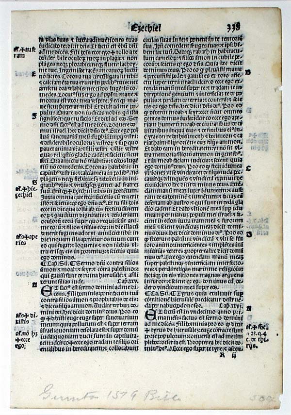 | 1579 A. D., Italy. Holy Bible. Supposedly issued by the house of Giunta, active in Florence and Venice over a long period. The assigned date seems too late for the typeface and format. |
# 38
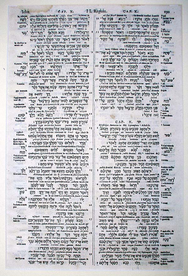 | 1584 A. D., Antwerp. The Hebrew Bible. Printed by Christopher Plantin. Plantin, a noteworthy publisher, contributed little to typography or book design, but became famous as a conscientious craftsman. |
#39
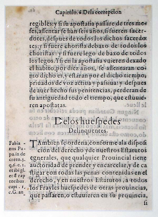 | 1585 A. D., Mexico City. Estatutos Generales de Barcelona. Printed by Pedro Ocharte. |
Issued more than half a century before the first book was printed in the North American colonies.
The indentations on the upper margin of the page were caused by the title being burnt into the top edge of the book. This was done so that the work could be shelved with ends out, backs presumably up to shed dust.
#40
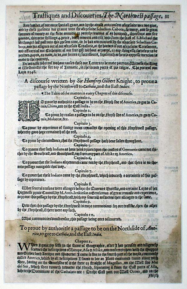 | 1598 – 1600 A. D., London. Hakluyt’s Voyages. Printed, Robert Barker. |
HAKLUYT * VOYAGES
"The prose epic of the modern English nation"- Frounde
PRINTED BY GEORGE BISHOP, ROLFE NEWBERRIE AND
ROBERT BARKER, LONDON. 1598 – 1600
This first complete edition of Hakluyt’s Voyages gathers and describes the "Principal Navigations, Voyages, Traffiques and Discoveries of the English and Farthest Distant Quarters of the Earth at any time within the Compass of these 1600 years."
This new and enlarged work was extended into three volumes. The third volume deals with America and comprises eighty-one voyages to the new continent, ranging from the period of discovery to the end of the sixteenth century. Here we find the ringing tales of achievements of the Cabots, Cartier, Frobisher, Raleigh, and Drake. Inspiration from this important and exciting compilation of England’s searchings "further than ever any Christian hitherto hath pierced" was, as has been frequently stated, largely responsible for Britain’s subsequent domination of the sea. The modern Hakluyt Society has issued over two hundred volumes, each dealing with a separate voyage, with an introduction by an eminent scholar.
# 41
 | 1602 A. D., London. The Works of Chaucer, Printer, Adam Islip. |
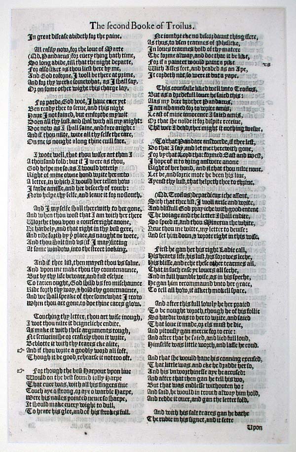
It has been the privilege of few human beings to enjoy the breadth and variety of personal experiences of life that were the lot of England’s first great poet, Geoffrey Chaucer (c. 1340-1400). He was a page in a royal household, prisoner of war, foreign diplomat, collector of customs, member of Parliament, and clerk of the King’s works. His personal background and wide reading in Latin, French and Italian ("of bokes rede I ofte, as I you tolde"), is mirrored in his Canterbury Tales. According to Dryden, "The matter and the manner of these tales and of their telling, are so suited to their different Education, Humor and Calling, that each would be improper in any other mouth." These tales represent almost every type of medieval literature: the pious tale, the saint’s legend, the sermon, the metrical romance and the romantic epic. The Canterbury Tales is Chaucer’s most famous and varied work. Trouilus and Criseyde, the most finished work on Chaucer, is one of the finest narratives in the English language. The poem, while dealing with an unimportant event of the Trojan war, becomes a great psychological study of the leading character, Troilus, son of King Priam, and of his love of the widow Criseyde. In mood, the work ranges from gay wit to tragic grief. Chaucer’s Romaunt of the Rose is a masterful translation of the great French allegory of refined love.
Adam Islip printed in London from the year 1594 to 1603. His first edition of Chaucer’s work was issued in 1598. Many "reforms" and "improvements" were made in the second Islip edition, "Sentence and proverbs noted….obscure words prooued, the Latine and French not Englished by Chaucer, translated."
# 42
 | 1608 A. D., Madrid. Cervantes’ Don Quixote. Printer, Juan de la Cuesta. |
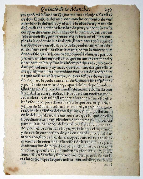
Miguel de Cervantes, poet, novelist, and dramatist, was endowed with a rich imagination, keen wit, penetrating intellect, and great knowledge of life and mankind. Poverty had forced him to enlist in war service against the Turks and African Corsairs. He was captured and enslaved for seven years before being ransomed. These experiences seemed to strengthen the natural faculties of Cervantes. In 1605, when the author was fifty-eight years of age, the first part of Don Quixote, the work that immortalized his name, appeared. Havelock Ellis in his essay on Don Quixote writes, "It leads us into an atmosphere in which the ideal and the real are at home. It blends together the gravest and gayest things in the world….It is a story that a child may enjoy, a tragic comedy that only the wisest can understand…It has entered into the lives of the people of every civilized land; it has become part of our human civilization." Don Quixote, "the most cosmopolitan, the most universal of books," has six hundred and sixty-seven other personages in addition to the two famous characters, Don Quixote and Sancho Panza. Not one of them is a villain. It is a coincidence that Shakespeare’s King Lear appeared the same year as Cervantes’ Don Quixote-and that both these authors died on the same day in 1615.
This third Madrid edition, printed in 1608 by Juan de la Cuesta, is known as the first "Academic" edition since the Madrid Academy considered it of great textual importance. Printing was at a low ebb at the beginning of the seventeenth century. Margaret Stillwell, commenting on this fact, adds, "If Cervantes had been born when the Spanish states were in ascendancy, who knows what stunning format some sixteenth century printer might have produced for Don Quixote!"
# 43
 | 1611 A. D., London. King James Version of the Bible. Printer, Robert Barker. |
In sheer literary excellence, it is hardly conceivable that the Bible of 1611 known as the King James Authorized Version will ever be surpassed. The scholars and linguists who worked for seven years on this version spared no pains to make it as perfect as they could. It was planned for the average man and woman. They did not disdain, as stated in the preface, "to bring back to the anvil that which we have hammered." The style is an evolution, "a revision of revisions" of the Bible made during the sixteenth century in England. It rests largely on the simple and energetic diction of Tyndale’s translation of the New Testament, first printed in Germany in the year 1525. The predominance of Saxon words is very remarkable. In the preface, drawn up by Dr. Miles Smith, later bishop of Gloucester, the authors disclaimed all originality and wrote, "We never thought from the beginning…to make if a bad one a good one….but to make a good one better or out of many good ones one principal good one." Many great English authors give unstinted praise to this Bible. Macaulay says, "If everything else in our language should perish this book would alone suffice to show the whole extent of its beauty and power." Tennyson says, "The Bible ought to be read, were it only for the sake of the grand English in which it is written, an education in itself." However, it was slow to win its ultimate position of unquestionable supremacy.
King James deserves little credit for this work which bears his name. Barker, the printer, advanced considerable money to the editors during the period of writing. The nickname, The "He" Bible, was given to the first printing because of the wording in Ruth III:15, "and he went into the city." The second issue printed "she".
# 44
 | Before 1612, A. D. Theatrum Orbis Terrarum. Produced by Abraham Ortelius, Flemish mapmaker of German origin, and ranking with Mercator in the sixteenth-century school of Dutch cartographers. For this work, the first modern atlas, large copper plates were engraved and occasionally changed as new information came in from mariners. Various editions opened, even as late as 1693, long after Ortelius’ death. |
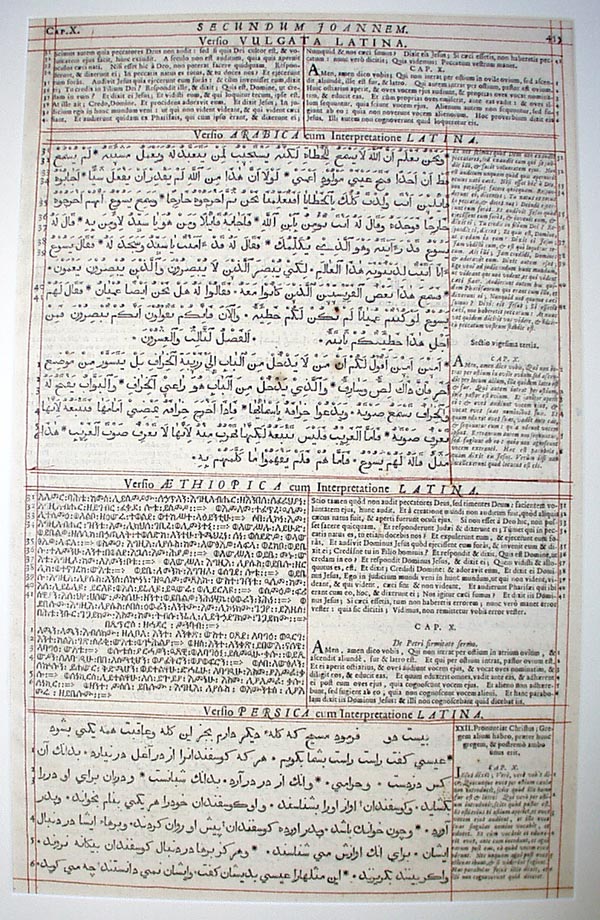 | 1657 A. D., London. London Polyglot Bible, New Testament. Printer, Thomas Roycroft. |
LEAF FROM THE
London Polyglot Bible (N.T.)
1657 A. D.
LONDINI. Imprimebat Thomas Roycroft
The New Testament of the fourth great polyglot which added for the first time the Persian and Ethiopic, with Latin translations. Altogether nine languages were used in this Bible. No one book, however, is printed in the full number. Dr. Brian Walton, the editor, was later consecrated Bishop of Chester in recognition for this great work. By permission of Oliver Cromwell, and later Charles II, the paper used was imported free of duty.
# 46
 | 1663 A. D., Leyden. States – General Bible. Printer, Johan Elzevir. |
1663 A. D. HOLLAND (Leiden). Johan Elzevir, States-General Bible. The standard Bible of the Dutch Reformed Church. It corresponds in importance to Luther’s version in Germany and the King James in England. Folio, double columns.
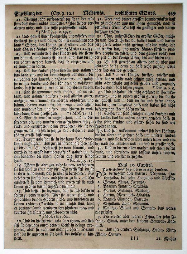
# 47
 | 1685 A. D., Cambridge, Mass. The John Eliot Indian Bible. Printed by Samel Green. |
1685 A. D., MASSACHUSETTS (Cambridge). John Eliot. Indian Bible. Samuel Green. (7 x 5 ½ inches).
John Eliot (1604 – 1690), "the Apostle to the Indians," came to New England in the year 1631. Well versed in classical language by his study at Cambridge, Eliot set himself to the difficult task of not only mastering the tongue of an unlettered people, but also of inventing a written language for the Algonquin tribe of Massachusetts. A number of religious tracts and educational pamphlets in this language had been prepared by Eliot and printed, for the conversion and enlightenment of these "praying Indians," before the great work of translating the entire Bible was undertaken.The title of the most important early book issued in Colonial America, the Indian Bible – Mamusse Wunneeetupanatanuve Up Biblum God, indicates the remarkable blending of language: Greek, Latin, English and Indian. The longest word in the amazing translation is "wutappesittukgussunnoohwehtunkquoh," signifying "kneeling down to him," Mark: 40. It is not surprising therefore, that Cotton Mather said, "words in this language must have been growing ever since the dispersal of Babel."
How many of Eliot’s "praying Indians" learned to read is not known, but Eliot wrote in 1680 to the Right Honourable Corporation in London, and asked for help in propagating the Gospel among Indians in New England, and in underwriting the heavy expense of printing a second edition. He stated in his plea: "thousands of souls, of whom some true believers, some learners, and some still infants and all of them beg, cry, entreat for Bibles, having already enjoyed that blessing, - but now are in great want."
No doubt the searching questions recorded by Eliot were propounded by reflective Bible readers:-
"If God made hell in one of six days, why did he make it before Adam sinned?" and "whether there might be not something, if only a little, gained by praying to ye devils?"
In 1682, Eliot, while revising the copy for this second issue, wrote, "We have but one man, the Indian printer, a sober, pious, ingenious person, well versed in the Scriptures, that is able to compose the sheet and correct the press with understanding." This John Printer became the first native American printer.
This Bible, as well as the first edition, was printed by Samuel Green at Harvard University Press. This press, established by Stephen Daye, was the first in what is now the United States. Green, when asked to undertake the large task of printing a Bible, issued an ultimatum to the University threatening that, unless another press and new type were forthcoming he would devote himself to another calling. His demands were met, and the Harvard University Press, the only one at that time in all the colonies, continued operating, with Green in charge, for a total of 43 years. In this long period he issued one hundred and twenty-four publications; the most important, however, was the Eliot Indian Bible. Similar to Aldus, Estienne, Plantin, (printers of the old world), Green established a family dynasty of printers in the new world, with the help of three of his nineteen sons, and other descendants of the same name. This dynasty lasted two hundred years, ending in 1845, with the death of Jonas Green, the second, fifth in descent from Samuel. This Green family did much to add enlightenment and honor to a young nation in its formative period.
# 48
 | 1743 A. D., Philadelphia. Cato Major. Printed by Benjamin Franklin. Printed in the types of John Caslon, perhaps the most durable of all typefaces since Caslon issued his first specimen sheet in 1734. |
# 49
 | 1743 A. D., Germantown, Pa. The First Germantown Bible. Printer, Christopher Sauer. |
1743 A. D., PENNSYLVANIA (Germantown). First Germantown Bible. Christopher Sauer, printer ( 9 ¼ x 7 inches).
Christopher Sauer (1693-1758) left his native Germany at the age of 31 to settle in Pennsylvania. The courage and zeal of this amazing craftman are more to be admitted that his many skills. Clockmaker, stove founder, distiller, and druggist in addition to printer, is not a complete list of the many activities of the elder Sauer.
In the year 1740, no one had the right or could obtain the necessary royal license to print a Bible, but Sauer, dared, not only to risk prosecution, but also bankruptcy. Bitterest opposition to the venture was raised by the Rev. Henry Muhlenberg, the strong leader of the German Lutheran Church, and the Rev. Casper School of the German Reformed Church. This opposition came about primarily because Sauer at the time was classed as an "arch separatist."
To please all the German population, the Sauer Bible was made a composite of Luther’s Bible, and Berleberg’s Bible, with an appendix to the new Testament, prepared by the printer himself. Three years were required to print this edition and twenty years to dispose of the 1200 copies. "The price," as Sauer wrote, "of our early finished Bible in plain binding with clasp will be eighteen shillings, but to poor and needy we have no price."
# 50
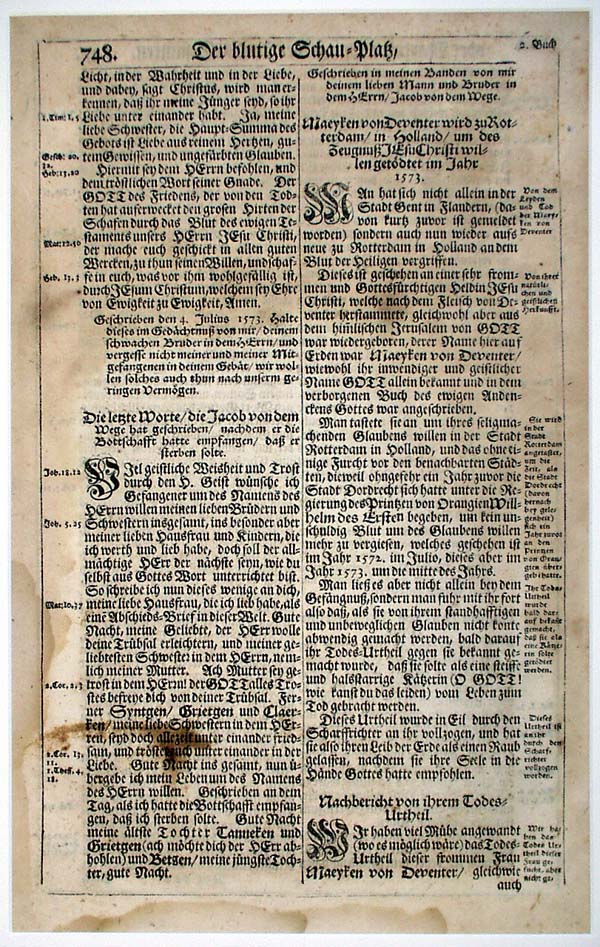 | 1748 A. D., Ephrata, Pa. Der Blutige Schau Platz. Seventh Day Baptist Brotherhood Press. |
1748 A. D. PENNSYLVANIA (Ephrata). Trelinan Van Braght, Der Blutige Schau Platz. Seventh Day Baptist Brotherhood Press. Folio Page. (13 ¾ x 8 ½ inches).
Van Braght, the author of Der Blutige Schau Platz (The Bloody Arena) wrote this account of martyrdom from the time of Christ to the middle of the 17th century. It is in Dutch, and was completed in 1660. It was prepared for the Ephrata Press, in Pennsylvania, by Peter Miller. In the Chronican Ephratense, brothers Lamech and Agrippa gave an interesting picture of the Seven Day Baptist Brotherhood during the publication of the most ambitious project in the annals of Colonial printing. "After the building of the mill was complete of the Book of Martyrs was taken in hand, to which important work fifteen Brothers were detailed, nine of whom had their work assigned in the printing department….the rest in the paper mills. Three years were spent on the book…The household of the brethren got deeply into debt, which, was soon liquidated by the heavy sales of the book…The book was printed in folio form (1512 pages) and the edition consisted of 1300 copies…the price of one copy wasFixed at twenty shillings. Those three years, during which said book was in press, proved an excellent preparation for spiritual Martyrdom, although during that time six failed and joined the world again…moderation and vigilance were observed…each had to submit to discipline at least once a day."
Recently Gustav Mori reported that from contemporary correspondence, Franklin sold some type founding equipment to the brotherhood, made offers for teaching them its use; also the Ephrata Brothers asserted at the end of one of their books that it had been printed with type of their own casting. Dard Hunter describes the paper making and water marks of the Ephrata Mills, other writers their early use of linseed oil for the making of printers’ ink, and still others concern themselves with the music publications of this interesting community.
# 51
 | 1753 A. D., Madrid. Euclid’s Elements of Geometry. Printed by [ ] Ibarra. |
# 52
 | 1753 A. D., Glasgow. Foulis’ Lucretius. Printed at the University of Glasgow from type cut by Alexander Wilson. |
# 53
 | 1757 A. D., Birminghan, England. The Poems of Virgil. Printed by John Baskerville. |
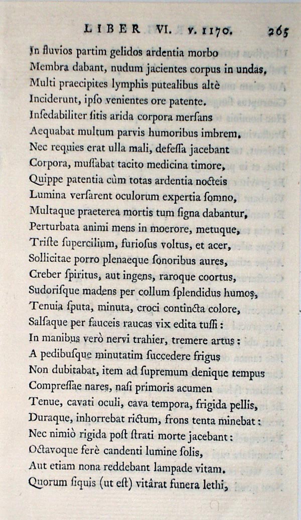
Virgil was the national poet of Augustan Rome. Under the patronage of the rich and powerful Maecenas he was enabled to live the tranquil and secluded life which so well fitted into his own ideals and temperament. In 37 B. C. he finished the Bucolica, which idealizes the farm life which he knew and loved so well in his youth. His second great work was the Georgica, a didactic, realistic poem. Both were written to make farm life in the country so attractive that a migration would start from the city. In the later period Virgil wrote his epic, the Aeneid, to glorify Rome and its rulers. This work bears a close relationship to the writings of Homer. Virgil in these poems assumes the tone of the prophet: "Rome has equally a mission to fulfill, which is to establish peace and order, and to rise the world through law." Virgil excels, in all his writing, in "that subtle fusion of the music and the meaning of language which touches the deepest and most secret springs of emotion." His influence on Dante, Chaucer, Spenser, Milton, Wordsworth and Tennyson is clearly evident. Dante selected Virgil to represent human wisdom and to act as his own guide through the Inferno.In the year 1750, John Baskerville decided to print, as an avocation,"…books of consequence an elegant dress and to purchase at such a price as will pay the extraordinary care and expense that must necessarily be bestowed upon them." Seven years later his first publication, this "Virgil," appeared. According to Macaulay, it "went forth to astonish all the librarians of Europe." The type of the day was modernized, the press improved, the paper "woven" instead of "laid" (a radical departure), and the freshly printed sheets were pressed between the hot plates to "glaze," thus giving such "perfect polish that we would suppose the paper made of silk rather than linen."
# 54
 | 1758 A. D., Twickenham, England. Noble and Royal Authors of England, by Horace Walpole. Printed at the Strawberry Hill Press. |
Author and litterateur Horace Walpole was an avid bookman and proprietor of a private press at his estate, Strawberry Hill. Many of his own works were printed under his supervision. The types are by John Caslon.
# 55
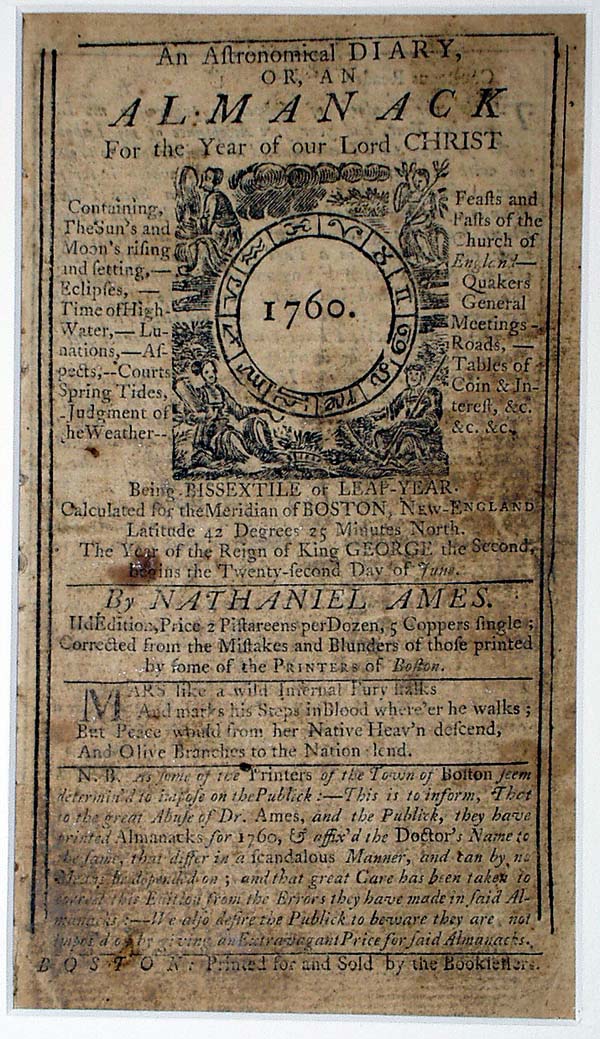 | 1760 A. D., Boston. Almanack for 1760 by Nathaniel Ames. Printed by Kneeland and Green. |
An example of the mass printing, typified by the popular almanacs, which had developed along the East Coast by the middle of the eighteenth century. For fifty years, George Washington kept a daily dairy in a succession of interleaved almanacs such as this one.
# 56
 | 1763 A. D., Germantown, Pa. The Second Germantown Bible. Printer, Christopher Sauer. |
1763 A. D. PENNSYLVANIA (Germantown). Second Germantown Bible. Christopher Sauer, Jr., printer (10 x 7 ¾ inches).
Christopher Sauer, Jr., was three years of age, when his father emigrated from Germany. He apparently was deeply religious and early in life was a leading member of the Church of the Brethren in Germantown and later ordained as an elder. In his preface he writes, "The Holy Scripture can be well linked to a good and well prepared article of food, which, to a rich person who hath a distaste for all food and desireth not to partake thereof, is a tasteless and strengthless dish, from which he deriveth not the slightest nourishment."It was the first Bible printed on American made paper. The watermark "WP" and a crown combined with Arms of Virginia identifies the paper as that manufactured by William Parks, of Williamsburg, Virginia. Two thousands copies of the second German Bible were printed.
# 57
 | 1782 A. D., Philadelphia. The Bible. Printed by Robert Aitken. |
THE "BIBLE OF THE REVOLUTION"
1782 A. D., PENNSYLVANIA (Philadelphia). R. Aitken at Pope’s Head, three doors above the Coffee House in Market Street (6 x 3 ½ inches). $6.50
Robert Aitken (1734 – 1802), a Quaker, left Ireland as a refugee from English prosecution and settled in Pennsylvania. In this country he defied the British. In his publication, The Pennsylvania Magazine, he supported the American revolutionary movement and determined to publish a Bible in English in violation of English laws. A story tells us that, when the British soldiers threatened to destroy his Bible type, it was hastily buried under a barn.In 1781 he petitioned Congress for sanction and financial aid to print this English edition of the Bible, to fill a need created, since none were being imported. Chaplains of Congress and other members of a committee recommended the publication of an edition of 30,000 copies at a cost of more than ten thousand dollars.
In 1782 a resolution in Congress was passed endorsing the Aitken Bible: - "Whereupon resolved: That the United States in Congress assembled highly approve the pious and laudable undertaking of Mr. Aitken….they recommend this edition of the Bible to the inhabitants of the United States." It was also later suggested to Congress that every soldier upon being mustered out of the service be presented with a copy of this Bible and under date of June 11, 1783, George Washington wrote to his friend, Dr. Rodgers, "your preposition respecting Mr. Aitken’s Bible would have been particularly noticed by me, had it been suggested in season. But the late resolution of Congress for discharging part of the army, taking of nearly two thirds of our number, it now is too late to make the attempt. It would have pleased me well if Congress had been pleased to make such an important present to the brave fellows, who have done so much for the Security of their Country’s Rights & Establishment…"
In the publication of this Bible, Aitken lost "more than three thousand pound specie." When the war was over, cheap imported Bibles flooded the market, so that most of the first Bibles in English, printed on this side of the Atlantic, were sold in job lots to various religious organizations for distribution among the poor. This Aitken Bible in now one of the rarest of collector’s items.
# 58
 | 1791 A. D., Worcester. The Bible. Printed by Isaiah Thomas. |
1791 A. D. MASSACHUSETTS (Worcester). First Quarto Bible. Isaiah Thomas, printer. (12 x 9 ¼ inches).
Isaiah Thomas (1749 – 1831) did the most extensive Bible publishing in Colonial times. He was apprenticed to a printer at the age of 6; illustrated a book with wood – cuts at the age of 13; retired on 1802 at the age of 53, one of the richest men in America. No doubt, a considerable part of this wealth came from his printing of various editions and sizes of the Bible. This most noted of Bible printers in the early days of the republic was called by Franklin "The Baskerville of America." In his prospectus announcing this quarto edition, he agreed to accept, in partial payment, "wheat, rye, indian corn, butter or pork, if delivered at his store in Worcester or at the store of himself and Company in Boston by the 20th day of December, 1790, the remaining sum of twenty-one shillings to be paid in cash, as soon as the books are ready for delivery." Thomas took unusual pains in preparing this text, comparing thirty different editions of the King James Bibles. He had every sheet examined by the Clergymen of Worcester.
# 59
 | 1794 A. D., Parma. Virgil Thompson’s Seasons/ Printed by Giambattisti Bodoni. Bodon’s type designs represented a sharp break from earlier forms, the serifs becoming narrowed to non-tapering lines. |
James Thomson, like Virgil, with leisure assured by patrons and a political pension, had unusual opportunities to observe nature and to write and rewrite his poems. The various parts of The Seasons first appeared between the years 1726 and 1730 and in their final polished form in 1744. With their swelling phrases and Latinized diction, these poems of Thomson’s are superficially Miltonic. Dr. Johnson wrote of Thomson, "The reader of The Seasons wonders that he never saw before what Thomson shows him and that he never felt what Thomson impresses." Today we still enjoy the sensitiveness to light and movement, the ultimate knowledge of the ways of animals and birds, and the ability of Thomson in his Seasons to lure as from a real world to imaginative reverie. With a subtle appreciation of quiet rural life is coupled a conception of a God in nature, as well as an unquestioning belief in the God of orthodox Christianity, and there is also an apparently unrelated enthusiasm for economic progress in Britain.It seems paradoxical that Bodoni, the founder of "classic" formalism in printing, chose to print Thomson’s romantic Seasons in sumptuous format and to include the following lines in the dedication to his patron, David Steuart, of Edinburgh: "If I particularly wish immortality to any of my works it is to this, that the testimony of my respect and gratitude for a person of so much worth and eminence may be handed down to future ages." Bodoni is often called "The King of Typographers and the Typographer of Kings." According to Peddie, Bodoni "incontestably represents the highest point of aestheticism that can be reached by typography."
# 60
 | 1804 A. D., London. Poems of Goldsmith, Parnell, and Somerville. Printed for the Shakespeare Printing Office. Bulmer typeface cut by William Martin. Woodcuts by Thomas Bewick. |
Martin’s type is closed as transitional, along with those of John Baskerville, but is somewhat bolder and with a characteristic italic.
Bewick’s woodcuts, made with the printing surface at varying levels to provide for more even inking, are well known.
INDEX OF PRINTERS
| Aldus Manutius (1450 – 1515) | |
| Venice, 1499 | no. 18 |
| Venice, 1513 | no. 20 |
| Venice, 1515 | no. 22 |
| Venice, 1518 | no. 24 |
| Aitken, Robert | |
| Philadelphia, 1782 | no. 57 |
| Bamler, Johann | |
| Augsburg, 1473 | no. 8 |
| Barker, Robert | |
| London, 1598 – 1600 | no. 40 |
| London, 1611 | no. 43 |
| Baskerville, John (1706 – 1775) | |
| Birmingham, England, 1757 | no. 53
|
| Bewick, Thomas (1753 – 1828)
| |
| London, 1804 (woodcuts) | no. 60
|
| Bodoni, Giambattisti (1740 – 1813)
| |
| Parma, 1794 | no. 59
|
| Cawood, John
| |
| London, 1570 | no. 33
|
| Cuesta, Juan de la
| |
| Madrid, 1608 | no. 42
|
| Day, John (1522 – 1548) | |
| London, 1578 | no. 36 |
| Egenolff, Christian | |
| Frankfurt, 1572 | no. 35 |
| Elzevir, Johan | |
| Leyden, 1663 | no. 46 |
| Estienne, Henri II (1531? – 1598) | |
| Geneva, 1570 | no. 32 |
| Estienne, Robert | |
| France, 1540 | no. 27 |
| Estienne family | |
| Geneva, 1555 | no. 29 |
| Franklin, Benjamin (1706 – 1790) | |
| Philadelphia, 1743 | no. 48 |
| Froben, Johann (1460 – 1527) | |
| Basle, 1493 | no. 14 |
| Basle, 1525 | no. 25 |
| Giolito | |
| Venice, 1559 | no. 31 |
| Giunta | |
| Italy, 1579? | no. 37 |
| Green, Samuel (1615 – 1702) | |
| Cambridge, Mass., 1685 | no. 47 |
| Ibarra | |
| Madrid, 1753 | no. 51 |
| Islip, Adam fl 1594 – 1603 | |
| London, 1602 | no. 41 |
| Jenson, Nicholas, d. 1480 | |
| Venice, 1472 | no. 6 |
| Jugge, Richard | |
| London, 1572 | no. 34 |
| Kneeland and Green | |
| Boston, 1760 | no. 55 |
| Koberger, Anton (c. 1445 – 1513) | |
| Nuremberg, 1493 | no. 13 |
| Nuremberg, 1497 | no. 17 |
| Maillet, | |
| Lyons, 1514 | no. 21 |
| Mentelin, John ( - 1478) | |
| Strassburg, 1472 | no. 5 |
| Ocharte, Pedro | |
| Mexico City, 1585 | no. 39 |
| Opornius | |
| Basle, 1555 | no. 30 |
| Ortelius, Abraham (1527 – 1598) | |
| Flanders, before 1612 | no. 44 |
| Pannartz, Arnold | |
| Rome, 1472 | no. 7 |
| Piasio, Petrusde | |
| Venice, 1491 | no. 12 |
| Piqouchet, Phillippe (fl. 1488 – 1503) | |
| Paris, 1497 | no. 16 |
| Plantin, Christopher (1514 – 1589) | |
| Antwerp, 1584 | no. 38 |
| Pynson, Richard ( d. 1530) | |
| London, 1527 | no. 26 |
| Ratdolt, Erhard (1442 – 1528) | |
| Venice, 1485 | no. 11 |
| Roycroft, Thomas | |
| London, 1657 | no. 45 |
| Saver, Christopher (1693 – 1758) | |
| Germantown, Pa., 1743 | no. 49 |
| Germantown, Pa., 1763 | no. 56 |
| Seventh Day Baptist Brotherhood Press | |
| Ephrata, Pa., 1748 | no. 50 |
| Shakespeare Printing Office | |
| London, 1804 | no. 60 |
| Sorg, Anton | |
| Augsburg, 1483 | no. 8 |
| Spire, Wendelin de | |
| Venice, 1470 | no. 3 |
| Venice, 1472 | no. 4 |
| Strawberry Hill Press (est. 1757) | |
| Twickenham, England, 1758 | no. 54 |
| Sweynheym, Conrad (d. 1473 or 1477) | |
| Rome | no. 7 |
| Thomas, Isaiah | |
| Massachusetts, 1791 | no. 58 |
| Tortis, Baptista de | |
| Venice, 1496 | no. 15 |
| Turnebus | |
| Italy, 1552 | no. 28 |
| University of Glasgow | |
| Glasgow, 1753 | no. 52 |
| Weiditz, Hans | |
| Frankfurt, 1572 woodcuts | no. 35 |
| Worde, Wynkyn de (d. 1535) | |
| London, 1512 | no. 19 |
| Zainer, Gunther | |
| Augsburg, 1476 | no. 7 |
![]()
last updated 3-2013, jr